When Google tested the designs behind Material 3 Expressive in 2025, across 46 studies and more than 18,000 participants, people found a Send button up to four times faster once it was made larger and more prominent. A 5 second test shows which of your screens has that problem before your drop-off numbers do.
What does a 5 second test tell you about the next step?
A 5 second test tells you whether someone who has never seen a screen can name its primary action, and very little beyond that.
The method fits in one line: a person sees a screen for five seconds, the screen is hidden, and they answer questions about what they remember and what they would do next.
That narrow scope is the point. Most write-ups of the method treat “What would you do next?” as one question among many, next to brand impressions and what people recall. On a product screen it should lead the test. A landing page has to explain a company. A product screen usually has one job: move the user to the next step without help.
Five seconds is long enough to see what stands out and too short to read anything closely. So the test rewards a screen with one clear priority and exposes a screen where several elements compete for the same glance. That is the property worth checking, because it is the one your team can no longer see. Everyone who built the screen already knows where the button is.
What the test won’t tell you is whether the whole flow is easy to use. Treat it as a check on one screen and one action, then move to the next screen.
Which screens should you test first?
Test the screens where a new user has to act with no one to ask: the first screen after sign-up, any identity or verification step, the empty dashboard, a payment or order confirmation, and the entry point for changing a booking or appointment.
These are the screens a fast first release, or a product built one feature at a time, tends to get wrong, for a predictable reason. When screens are built without a dedicated designer, they usually show the data the system holds rather than the action the user needs. A new account’s dashboard shows empty charts and zero totals, while the first action, such as “Add your first project” or “Add money”, sits as a small link in a corner. A manage-booking screen lists every detail of the booking, and the “Change” button sits below the fold on a phone.
Each of these is a moment where a stall costs you a user. Someone who can’t work out the next step on an ID upload screen often won’t raise a support ticket. They close the app and finish sign-up somewhere else, or not at all. Left alone, these small gaps pile up into hidden UX debt that gets harder to fix with every release.
Skip the screens built for trained staff who use them all day, such as operations consoles, reporting dashboards and reconciliation tools. Those users learn layouts through repetition, so an outsider’s five-second glimpse will flag problems your daily users don’t have. Task-based testing with real staff suits those screens better.
How do you run a 5 second test without a researcher?
You can run a useful 5 second test in an afternoon with a screenshot, a timer and five people who have never used your product. This method suits a small team with no dedicated designer.
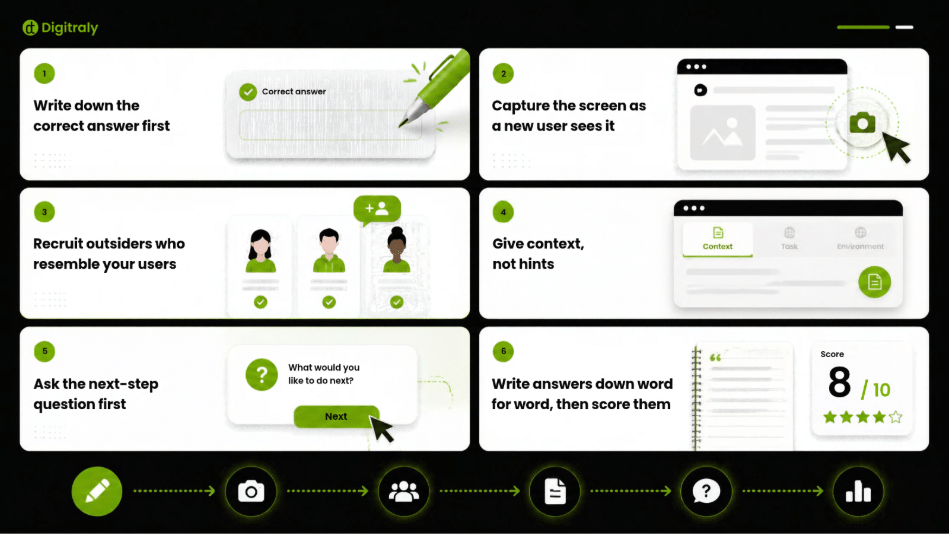
- Write down the correct answer first: Pick one screen and write the action a new user should take, in plain words. Do it before you see any answers, or you’ll grade generously afterwards.
- Capture the screen as a new user sees it: Use real phone size if most users arrive on a phone, and the real data state, which for a new user usually means empty. Remove annotations and anything added for sales demos.
- Recruit outsiders who resemble your users: Your team, your investors and friends who’ve heard the pitch already know the answer. For an identity check, recruit people who have done one in another app.
- Give context, not hints: One line is enough: “You’ve just signed up for this app. This is the next screen.” Never mention the button or section you’re testing.
- Ask the next-step question first: After five seconds, hide the screen and ask: “What would you do next on this screen?” Recall fades fast, so the first question gets the cleanest answer. Then ask what the screen was for.
- Write answers down word for word, then score them: Paraphrasing while you take notes is where wishful reading creeps in.
How do you score 5 second test answers?
Score each answer by the type of failure, not simply pass or fail, because each failure type points to a different fix. The scorecard below maps what people say to what it usually means and where to start.
The Next-Step Scorecard
| What they said | What it usually means | What you’ll see in product data | First move |
| Names the right action | The screen does its job | Normal step completion | Leave it alone |
| Right action, unsure where it is | The action exists but doesn’t stand out | Hesitation, repeat taps, long time on the step | Make the action larger, higher or the only button |
| Names a different action | Two elements compete for attention | Users leave for the wrong screen | Demote or remove the competing element |
| Describes the screen, no action | The screen informs but doesn’t direct | Users stall, then drop off | Rewrite the heading and button around the action |
| “Don’t know” | Too much on screen, or missing context | Support contacts and drop-off on this step | Cut content, then retest |
Two fixes come up more than the rest: making the main action stand out, and removing whatever competes with it. Both have firm backing. Google’s research found prominence alone made a key button far quicker to find, and the Queensland Government Design System allows one primary button per page, because people slow down when they have to compare several likely options.
Read the pattern, not single answers. With five people, one answer moves your result by 20 percentage points, so one odd reply is noise. Two people naming the same wrong action is a signal.
Here is a 5 second test example. Five people see an ID upload step during sign-up. Two say they’d upload their ID. Two say they’d tap a banner offering a referral reward. One doesn’t know. The screen fails, and the scorecard points to the fix: the banner competes with the primary action, so it comes off this step. Retest with five new people after the change.
When is the 5 second test the wrong tool?
The 5 second test is the wrong tool when the question is whether users can finish a task, when the screen serves trained daily users, or when the delay comes from the system rather than the design.
Naming the next step isn’t the same as completing it. A screen can pass and the flow can still fail two screens later. Once a screen passes, give three to five people a real task on a clickable prototype and watch where the first click lands and where they hesitate.
Dense screens are a poor fit too. If people must read a table or a long form before they know what to do, a five-second glimpse mostly measures reading speed. Simplify the screen first, or skip straight to a task-based test.
And if users are waiting on slow loads, failed verifications or wrong balances, a five-second glimpse will describe symptoms that design can’t fix. Fix the backend first, then test the screen.
Conclusion: what to do next
A 5 second test won’t tell you whether your product is easy to use. It will tell you, in an afternoon and with five people, whether new users can find the one action each screen exists for. That is the cheapest check a small team can run before it scales a flow to thousands of users, and the fix it points to is usually small, such as a larger button or one fewer element competing for attention.
Pick the screen your support team explains most often, show it to five people for five seconds, and let their answers decide what changes first.