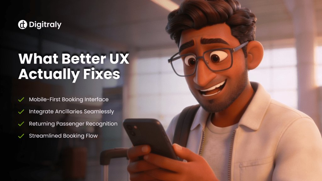
Where Direct Booking Flows Go Wrong
The Search
Rigid fields that do not accommodate flexible travel plans. A calendar that is hard to use on a phone. No recognition of returning passengers even when they are logged in.
The Steps
Too many of them. Information entered on one screen that disappears by the next. Baggage and seat selection appearing as separate interruptions rather than part of a connected flow. It feels like a back office system rather than a booking experience.
The Mobile Experience
Most flight searches now happen on a phone. Most airline direct booking flows were built for a desktop. Buttons are hard to tap. Progress is invisible. Forms ask for information in the wrong order. The traveller gives up before reaching payment.
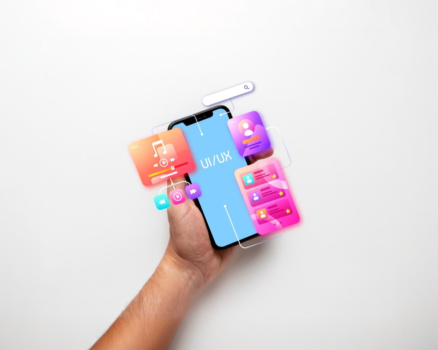
What Good Actually Looks Like
Run an Audit Before Touching Anything
Before redesigning a single screen, understand where people are actually leaving and why. A UX design audit turns internal assumptions into evidence and makes sure the right problems get fixed first.
Show the Real Price
Early
Total cost including taxes and fees should be visible from the search results. Not at checkout. Not halfway through. From the start. Travellers who see the full price early make faster decisions and complete more bookings.
Cut Every Step You Can
If a field can be pre-filled, pre-fill it. If two screens can be one, make them one. The fewer decisions required before payment, the more bookings get completed. Every extra step is a moment where the OTA feels like an easier option.
Build for Mobile
First
Design the booking flow for a thumb on a small screen. Make tap targets generous. Show clear progress so the traveller always knows how far they are from finishing. A mobile first flow works well on desktop. A desktop flow adapted for mobile usually does not.
Make Extras Feel
Natural
Seat upgrades and baggage options should feel like helpful choices rather than interruptions. Show them at the right moment and they convert. Show them as barriers and they get dismissed every time.
Remember Returning Passengers
Someone who has booked before should not start from scratch. Pre-fill their details. Surface their preferences. It takes seconds to implement and it changes how the whole experience feels.

Why It Keeps Getting Ignored
Most airlines know the direct booking experience needs work. The reason it keeps getting pushed down the list is fear of disrupting something that is currently working well enough. That thinking has a cost. Every day the flow underperforms, it quietly redirects revenue to OTA platforms. Not because those platforms have better prices, because they have a better flow.
The good news is that improving the direct booking experience rarely means rebuilding everything. Many of the highest impact changes happen at the interface level without touching the underlying reservation system.
Digitraly’s airline UX design services start by identifying exactly where the current flow is losing bookings and structure the work around improving it without disrupting what is already live.