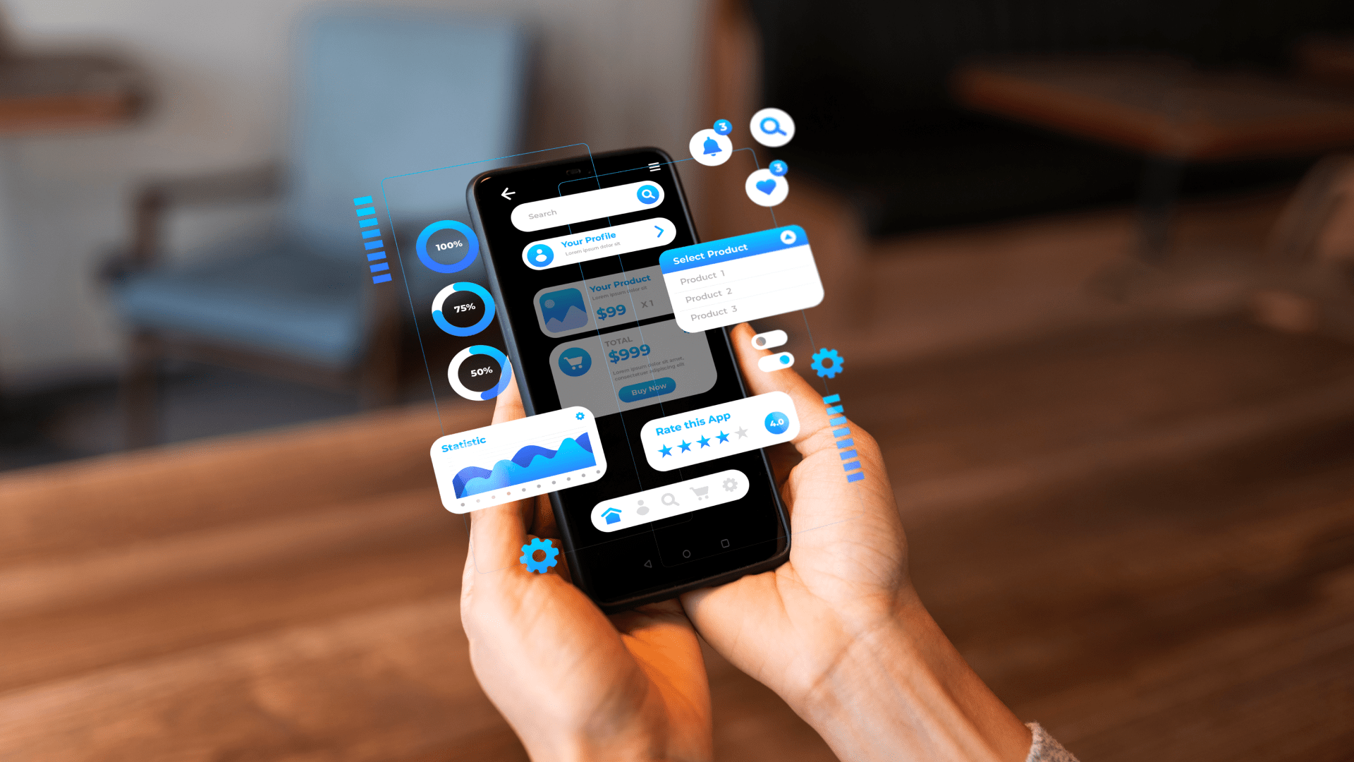
They use cracked phones. They share devices. They switch between languages. With 3% battery and zero patience, they scroll while holding crying babies or during night shifts. That’s the real world. However, we still design for some unseen “ideal user” who is still attentive and grips the newest phone using two hands. That user rarely exists.
Designing for difference and for inclusive UX is not just about kindness. It is a design strategy. For actual people, it makes for experiences that are powerful, intuitive, relevant, and rooted in inclusive design principles.
The Myth of the Average User
It’s easy to fall into the trap of designing for a neat little persona: fluent in English, urban, 28 years old, owns an iPhone, also always has a charger nearby, and swipes confidently. However, what about someone who borrows a phone nightly only from a cousin to settle debts? Or someone whose entire salary is managed by someone else?
I did once build for myself a financial planner during a college UX project because I assumed digital payments were a given thing. A worker during part of the time from a town that was nearby spoke up when I gave it a test, stating, “I use this phone only when my sister lets me borrow the phone. “The worker only uses the phone in this specific type of circumstance. “I need to see my spending—quickly.” That feedback from the whole design brief, not a detail, mattered.
This is where inclusive user research becomes essential. We stop designing for averages when everything is subject to change. Then we begin designing for diversity and start moving toward truly inclusive UX design.
Designing for Real-World Conditions
Apps don’t always operate in ideal circumstances. They are not used in silence, with stable Wi-Fi, with a clear head, and with ideal posture. More frequently, they open them in the midst of chaos—while multitasking out of exhaustion, on a bus with spotty internet, or on a noisy street.
This is why adaptive UI design matters. We need digital products that adapt to a variety of usage environments and device conditions.
I once observed a mother attempting to use a gorgeously designed health app to schedule a visit with a doctor. She had her phone in one hand and a toddler in the other. She gave up when she saw that the confirmation button was concealed beneath a chatbot icon. The context was overlooked, but the design was correct.
At that point, I discovered something that no tutorial or tool had ever taught me: well-designed things function well in stressful situations. That’s the essence of inclusive UX.
When Design Feels Like Being Seen
When a product simply “gets” you, there’s a subtle sort of magic involved. For example, allowing you to select a name with an accent. or when your gender isn’t assumed. Or when the user interface addresses you as a person rather than a client.
The user setup flow in a project I worked on only offered options for males and females. “So, what am I supposed to pick?” someone asked, pausing during a casual test. It was all in that pause. The message is the lack of options. “We didn’t think of you,” it reads.
This is why diversity and inclusion in design is never just a checkbox. It shows up in inclusive UX design examples. It shows up in details that make people feel safe, seen, and understood. It is how products earn trust and loyalty. This is diversity by design and inclusion by design working together.
Better for One, Better for All
Designing for difference isn’t just about “edge cases.” It’s about strengthening the whole system. A smoother, simpler, calmer interface for one person often benefits everyone.
A friend with ADHD told me she deletes apps with too many buttons or pop-ups. She needs things to be focused and slow-paced. I redesigned one app with that in mind—and surprisingly, everyone found it easier. People stayed longer. Completed more actions. Said it felt “less stressful.”
It clicked. Designing for one kind of difference didn’t narrow the design—it refined it.